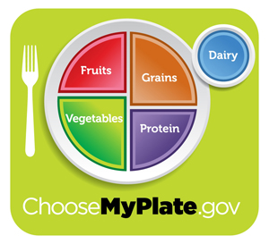
Everyone in the food press seems to be weighing in on the new replacement for the much-cursed USDA Food Pyramid in all (both?) its glorious confusion and obfuscation of real nutritional goals that might have (and should have) undermined the beef, corn, pork, corn, sugar, corn, and soy industries if they’d ever been presented honestly.
So where does that leave us? With ears of fresh corn that are more than 50 cents apiece in Los Angeles supermarkets, and the new…
Already, the USDA’s MyPlate web site is in a certain amount of branding trouble (and of course, that’s what counts most in America): the Texas DMV had already bagged “MyPlates.com” for its vanity license plate division (highly unappetizing), and Livestrong.com already has its own well-established “MyPlate” food calculator and fan base. And those items come up first on Google searches. As in, the whole first page or more. The government site ranks way down the list and had to water down the impact of its original name choice with “choose” just to get a URL. Can it elbow out the competition just by bolding the “MyPlate” part?
What really counts are the food and nutrition opinion maker comments, though. And a lot of those are detracting in a nitpicking way that I think kind of misses the point.
The first thing they all have to say is that the plate looks dumbed down. Forgive me, but wasn’t the Food Pyramid’s unreadable and unusable design a large part of the problem? The MyPlate icon is simpler and more direct, and it names real food groups, not “Big Mac” or, on the haute side of things, any of Ferran Adrià’s foams. No wonder foodies and populists alike are wondering what it has to do with them.
A small sampling of the main arguments:
MyPlate: The Food Pyramid for dummies? (LA Times): Dr. Andrew Weil and others discuss what’s still wrong with the new icon. Weil says “fruits” could still include fruit juice, which is usually a useless sugar bomb in comparison with whole fruit, and he worries that the protein section, which comes with a guideline to eat 8 oz. of fish per week, might encourage unthinking people to increase their mercury intake since swordfish is on the guideline menu, as are some of the generally overfished popular species of fish. Weil’s not wrong about the fruit juice vs. actual fruit, but his hand-wringing about fish is really geared for well-off readers who can afford to eat much of it. All the fishes he names are Continue reading
Filed under: cooking, DASH Diet, Diabetes, Eating out, Food Blogs, Food Magazines, Food Politics, frugality, history, kid food, nutrition, shopping, unappetizing, Vegetabalia | Tagged: chooseMyPlate.gov, David Cassidy, fast food, Food Pyramid, Four Food Groups, fresh produce, Livestrong, Marion Nestle, Michelle Obama, MyPlate, nutrition, processed food, public health, supermarkets, USDA, vegetables | Comments Off on The new MyPlate icon–fantastic or plastic?


